Color Spree

Color Spree
My favorite color is "all of them." What's yours?

Wednesday, May 25, 2011

Joe Miller’s Signature Travel Kit


Joe Miller’s Signature Travel Kit is a luxury, not a necessity unless you don’t already have a plein air watercolor kit. If you do, it’s still a wonderful luxury item with a well designed real leather case, steel water bottles and collapsible water cups, a metal palette box, travel brush, elastic loops for more brushes and tools plus a postcard sized Kilimanjaro watercolor block. It contains everything you need except paint.


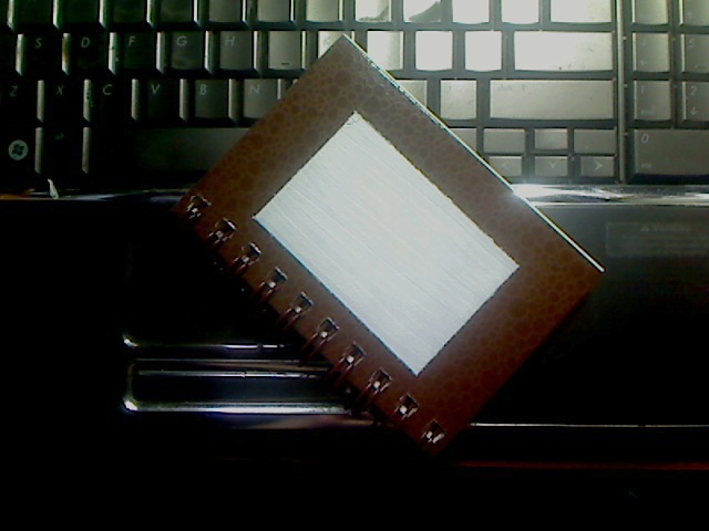
I didn’t realize until I had it in my hands that the metal palette box has a design on the lid. It’s ornamental and old fashioned, reminiscent of Victoriana or Old West saddle ornaments, any 19th century decorative elements. That gives me a little lift, makes me think of the days when adventurous people carried small watercolor sets across the globe instead of cameras. Like the leather and metal, it’s a small luxury element, something not necessary but very pleasant that gives me a feeling of prosperity and ease.


I waited for quite a while before purchasing it because I already use my Winsor & Newton Field Box whenever I go out to paint - or go out for anything, because I might get a a chance to stop and paint. But this small extravagance turned out to be more useful than I thought it would be.

For someone disabled who has mobility impairments as I do, taking your supplies to the living room or another room may be a plein air trip in itself. What’s convenient for hiking may also be convenient for someone working an office job who’d like to use lunches and breaks to improve their watercolor painting. The kit is well designed, classy and would not be out of place in a high end business environment, provided you’re willing to let your coworkers know you’re a painter.

The leather case is quite small, only 2” deep by 6” wide and 6 1/2” tall, external measurements. The shoulder strap is very long and can be shortened. Two side zipper pulls bring the front flap down. Elastic bands keep brushes and tools in place on the flap and on the back of the case, the only loose things in the bag are the postcard sized watercolor block and the palette box. The water bottles fit into pockets on the back with the two collapsible water cups between them in their pockets. This design keeps all the contents organized. Brushes don’t fall out and neither do any sketch pencils or other tools you want to tuck into the row of elastic bands on the flap.

The tall narrow water bottles hold quite a lot of water. So do the collapsible steel water cups. They hold firm when pulled up tightly, yet collapse again easily after emptying. Put in a pocket pack of facial tissues for cleanup and you can wipe them out on the spot in a lunch room, especially if you don’t fill them very deep. There’s room for that pack of tissues along with the original items, also for a pocket Moleskine or other small conveniences.

Because it’s so organized, I found myself using it often when I don’t feel like getting up to get water. The elastic band slots became a place I could always find my good travel brushes. The only improvement I’d suggest is replacing the small travel brush included with a larger round travel brush that has a cap. I keep the original Joe Miller one in an elastic band rather than inside the palette so that I don’t accidentally turn it hairs end down while it’s wet and destroy the brush. But a travel brush with a cap that fits inside the palette or a retractible brush like some travel brush models could sit in the palette in front of the half pans.

A waterbrush like the Niji Waterbrush or the Derwent Waterbrush would make this little kit even more convenient for someone who's convalescing or disabled. It might make a very good gift for crafty or artistic friends in the hospital, but I'd add a waterbrush to it along with a dozen tubes of good artist grade paint to make it a complete set.


The metal palette box is not enameled inside. It comes with 12 empty half pans to fill with your favorite tube watercolors. I chose 12 of my Daniel Smith watercolors to create a transparent palette, a little different from my other 12 color watercolor sets. Since then I’ve found myself using that little palette a lot more.

Refilling this palette can be a serious bargain and also give you more choice of colors than any 12 color pocket watercolor set. I chose Quinacridone Gold and Quinacridone Burnt Orange instead of Yellow Ochre and Burnt Sienna, both colors are much more transparent. Then added Sodalite Genuine, a mineral blue-black like Paynes Grey with a pretty texture instead of the usual Ivory Black. I could also load it with different seasonal palettes, switching out some colors for others to reflect changing sky and land hues.

It may help to tuck in a folding plastic palette for mixing on a white surface. I mixed in the metal lid of the little palette box and got good mixtures though. Otherwise you may want to add one of the inexpensive folding plastic palettes available at Blick or Daniel Smith, if you don’t like mixing on a shiny metal surface.

Either a waterbrush or a larger watercolor travel brush would be a good addition though. While the included pocket brush isn't as tiny as the ones in Winsor & Newton Field Boxes, it's still only a size 2 round. You may want to have a larger round such as a size 6, 8 or even 10. I added a size 8 round and a very large squirrel mop, both of them pocket brushes with caps, so that when I'm doing loose styles or large washes on the block I'm not struggling to do it with a detail brush. The case has extra loops for brushes so any short handled brush will fit in those loops or pockets. There's a perfect size pocket for that squirrel mop, which is so fat it's like a little metal cigar.

Because it’s so compact, well organized, convenient and decorative, Joe Miller’s Signature Travel Kit has inspired me to use it more often. Its convenience works either for lazing around without getting up for water or for going out when I don’t want to carry much weight. Its luxury materials and old fashioned design give me a lift whenever I look at it, which gives me an itch to paint something representational.

The collapsible cups are incredibly handy. My grandmother had a plastic one designed like these that she kept in her purse. I can remember her using it at public drinking fountains, amazed that it collapsed that small when she’d finished drinking to go back in her purse. It was a neat little gadget that I thought went out of style and got forgotten in favor of thermal travel mugs and other more modern conveniences. Now it’s back in an even more elegant form, the stainless steel ones are more durable and their shiny texture makes them good still life objects.

So are the clean cylindrical water jars with their knurled lids. Set these objects out on any surface and you have something cool to paint as well as all the things you need to paint it with. The literal beauty of these tools is something inspiring in itself. It’s one of the main reasons I bought the kit and one of the big reasons I don’t regret it.

If you like vintage things, if you like old watercolors and Victoriana, small gadgets that are genuinely useful, then this is an extravagance that could pay for itself if it encourages you to paint more often.

Get it if you like it and don’t bother if it’s not your style - there are other good kits just as well organized if you prefer a more modern style in plastic. Me, I love the steel and leather, also the way the steel and leather doesn’t stain like plastic. Some of my plastic watercolor pan sets have gotten a bit colorful and grungy over the years, scuffed and banged around.

The price is reasonable at $49.99 but watch for sales. It’s comparable to other products and the quality materials with good design make it very worthwhile. If you are just starting out and don’t have a field kit of any sort, this can be very cost effective since artist grade tube watercolors cost much less than half pans and give you much more paint.

I don’t regret it at all. This little kit hangs on the back of my chair when I’m not going out, or sits on the bed in reach. I use it often often when I’m art journaling. Treat yourself if you like the style and especially if you prefer choosing your own colors in a 12 color pocket set. Other 12 color metal palette tins aren't that much less without the leather case, water bottles and all those perks.

Wednesday, May 18, 2011


Daniel Smith Watercolor Ground is a new product, a primer that can turn any surface into a good watercolor surface similar to stretched watercolor paper. I saw the ads for it and thought it was a great idea - not only watercolor but any medium that works well on watercolor paper can be used on surfaces you want to decorate. Wooden plaques, metal trays or mugs, plastic travel mugs, shiny slick art journal covers... there's no limit to what you can use this stuff on and create a good paintable surface.

My first experiment using it was a resounding success. I love this stuff. It didn't take much to cover the small area I painted. The pint jar is a generous size that will cover a lot of surface, just like the Colourfix sanded pastel primers. So this product is a bargain for creating archival watercolor surfaces on anything durable you have at hand.

Daniel Smith Watercolor Ground will also allow mixed media effects using watercolor passages in almost anything and can be used as an opaque correction medium for changing large areas of a watercolor painting on paper. The only surface I would not use it on would be something like an oil pastel painting, where nondrying oils will never dry under it and may slide, or an oil painting that hasn't completely cured.

Below is a photo record and description of my first experiment with Daniel Smith Watercolor Ground.


I decided my first use would be to put a decorative watercolor image on the cover of my small Strathmore Visual Art Journal. The outside glossy printed card cover would protect the art, while the glossy brown inside cover looked plain. I thought it would make a good frame for the design area, so masked it off with ordinary masking tape.

Instructions on my jar of Daniel Smith Watercolor Ground said that I should let it cure for two or three days before painting. Good that they mentioned that. Read the instructions.

I included the sandpaper block in the photo because the instructions also suggested roughing up any smooth or glossy surface so the Daniel Smith Watercolor Ground bonds better to it. That made sense to me, so as soon as I got that photo, I peeled the top layer of sandpaper off and used it to scuff up the picture area.


I used a synthetic 3/4" wide watercolor flat brush that I normally use with Art Spectrum Colourfix sanded pastel primer to apply Daniel Smith Watercolor Ground to the picture area. The first coat seemed mostly opaque but I decided I wanted to give it two or three coats to be sure of good coverage.

It went on heavy with a texture that felt like a cross between thinned plaster and heavy body acrylics. I was very pleased with its opacity and feel. It held brush strokes a bit like heavy body acrylic, but these can be sanded down if you add extra layers to allow for the sanding and prefer a smooth surface. I liked the strokes so I kept them for added texture.

I used three coats, letting each one dry before putting the next. A little bit of it got messed up at one corner and I was able to press it back into place when it was damp using a metal scraping tool on my nailfile. I use that tool for sgraffito and moving paint around all the time and it handled like pushing around wet acrylic.


The primed surface, ready to paint.

I removed my masking tape to find a smooth edged, white, clean painting surface ready to go. I let that cure for three days before starting my painting last night. Don't forget this step unless you want to test what the problems are with using Daniel Smith Watercolor Ground too early. I have a feeling that it might have reactivated and washed off if it wasn't completely cured.


Finished painting "Red Rose Study II" on Strathmore Visual Journal glossy textured brown cover using Daniel Smith watercolors and Stabilo Point 88 fine point watersoluble black pen.

I got out my handy Daniel Smith Watercolor Sticks and mixed a dark color in a porcelain palette using Indanthrone Blue and Burnt Umber with a touch of Permanent Alizarin Crimson. Painting around the shape of the rose, I created random fern and leaf shapes to make a design. The areas I painted first had good crisp edges and the color soaked right in fast.

Handling the paint on it was surprising. I'm used to watercolor blocks and to using watercolor paper with the sizing still on. Rinsing and stretching watercolor paper was too physically difficult for my disabilities, so I got used to heavy sizing as part of my watercolor techniques. This surface is absorbent!

It's like the opposite of Yupo. On Yupo plastic watercolor surface, the color does not sink in at all and will freely flow from one area to the next. It takes a lot of skill to make Yupo paintings work, but they come out vibrant and strong because none of it sinks in. Daniel Smith Watercolor Ground creates a surface that's almost like blotter paper. It's thirsty, it sucks in your paint and it feels touch dry long before it is dry.

I sketched in some shadows with the same dark mixture on the rose itself knowing it went very dark and that I'd glaze over it with Quinacridone Coral and Permanent Alizarin Crimson. The initial marks were crisp, hard edged and delicate. I waited till I thought it was dry and started my glazing with Sap Green on all the foliage and Quinacridone Coral on the rose.

Wow. My hard-edged original marks melted to soft-edged ones immediately. That didn't destroy the painting, it was just an unexpected effect that created some interesting soft-edged hue shifts. After that glaze, I waited much longer for the painting to really dry before adding the second glaze. The color lightened considerably when it was dry, just as watercolor usually does on paper. My second glaze restored the intensity of the colors to what I first intended and I reworked the background, adding areas of the original mix and some of the foliage and flower colors to some areas. I also brought in a little Ultramarine in the background.

My final version of the rose looked great but I decided it could use some pen accents, so tested my black Stabilo Point 88 pen on it. Pen marks came out strong and crisp just as if I was working on a fine-grained watercolor paper. I washed out the pen work to soften it and that behaved exactly the way pen over watercolor does on paper.

After taking the photo, I sprayed my painting with Krylon UV-protective matte fixative as a final protective coat. That eliminated the shine of the brown background but it doesn't look bad. If I had it to do over again I'd have kept the masking tape on till I was done with the painting. The fixative did not change the color or texture of the painted area at all and it did not dissolve the watercolor ground.

Daniel Smith recommends using a Golden archival varnish on finished projects, especially when they're on unlikely surfaces that will not be framed under glass. It stands up fine to Krylon UV Protective though, so brand name on your choice of varnish may not be a problem. I will be trying Blick Gloss Fixative varnish on another piece sometime to see how that handles, but I wanted an archival, non yellowing varnish if it isn't going to be removable.

Daniel Smith Watercolor Ground is a good product. It's well worth the price. Titanium White is the main pigment that makes it opaque so it creates a good bright white surface for any water medium. I have not tried it with thinner based paints or mediums, such as thinning colored pencils passages, but will update if using mineral spirits or other thinners dissolves it. For any water thinned medium, this surface is a joy to use.

It's also extremely cost effective for creating good archival watercolor surfaces from found objects, recycled surfaces, MDF panels or anything else you want to paint on. Using it on Yupo plastic watercolor surface will give an interesting variety of absorbent or non-absorbent effects that would make a watercolor painting look like mixed media. It has a thousand uses and many of them will save you money.

I love the stuff and will always keep it on hand, there's nothing better than being able to paint on whatever takes my fancy.

Daniel Smith Watercolor Ground is available at Daniel Smith online. Other companies that carry Daniel Smith products may have it available.

Here's a link with image to the Daniel Smith website:

Daniel Smith Fine Quality Artists' Materials

Saturday, May 7, 2011

Tombow Dual Brush Pens


Tombow Dual Tip Brush Pens are my favorite medium, bar none, for creating notans. I used them to create the examples in the article I linked to. They're convenient, the brush tip keeps its shape for the lifetime of the pen and the writing tip on the back end is great for details or captions.

These would be the world's best brush tip pens if they were also lightfast and archival like the Pitt Artist Pens. There is a difference between Lightfast, Fadeproof and Archival in art products. Lightfastness means that it's rated to resist fading from exposure to light, as in a picture you hang framed on the wall. Fadeproof means that if you sketch within a sketchbook, it won't chemically age and fade even without light exposure - an important distinction for some types of art that won't see the light often, such as ATCs stored in an album or sketches within a bound sketchbook that you'd like to refer back to decades later. Archival and acid free means it's not going to acidify the paper, causing it to yellow and crumble.

Tombow Dual Brush Pens are odorless, use no toxic inks or pigments and are acid-free. I have not seen any fading in closed sketchbooks where I've done pen sketches years ago, but I also don't have any 20 year old sketches done with them either. I used these in the 1980s but lost my old sketchbooks in assorted floods and moves so I can't say how long lasting they are for scrapbooking. Acid free does mean that even if they do fade or change color over years, they will not harm the paper and ruin the book.

The barrel's anti roll design is mentioned in the description. This is true if you keep the pen capped. Leave off the cap on the brush tip end and it'll roll as easily as any round pen. The anti-roll design is a little projection on the brush tip cap that'll stop it neatly after one revolution. I do like it. You should still remember to cap your pens anyway to keep them from drying out. Very few pens can stand up to being left open for hours or days.

Tombow does not claim these pens won't fade. They're an illustration medium, intended for works where the reproduction is the original. When you do a fashion drawing or an illustration, scanning or photographing it and then printing it in archival inks can make it permanent. I recommend scanning anything you produce with Tombow Dual Tip Brush Pens, because without that claim I don't trust that they won't fade even in a closed sketchbook.

They are so expressive, powerful and easy to use that I love them anyway. The brush tip is a cone of spongy material that keeps a fine point. It will give marks comparable to using a high quality sable pointed round brush or a high quality Chinese or Japanese ink brush. Pressure will give you everything from a delicate thin line to a calligraphic stroke. If you want to learn Chinese or Japanese calligraphy, these pens will make practice convenient.

Tombow has been making these brush pens for a long time, they're still popular in Japanese markets and are probably their equivalent of a chisel tip calligraphy pen. Something you can write fancy gift cards and notes with to the level of your skill without fussing with bottled ink and dip pens or brushes. This makes them extremely useful to artists who start with drawing and are less experienced with brushwork.

Learning to handle a Tombow brush pen will improve your painting skills, especially in watercolor. Tombow has 96 colors available in these popular illustration tools. They used to come in a big square holder where each pen sits vertically, though I don't know if that full range set is still available. They are available in open stock and also in 6 or 10 pen wallet sets.

10 pen wallet sets include a colorless blender and most if not all of them don't overlap colors. I haven't systematically checked all combinations for overlaps and black does appear in about half of the 10 color wallet sets. Other colors don't seem to turn up repeatedly, so multiple sets will give you mostly new colors. Extra Black and Colorless Blender pens are always useful though, especially in comics art.

The nylon writing tip is a typical felt tip. It will get mashed down if you write too heavily with it and wear down with heavy use. It's still convenient even if it has mashed down a bit, just won't give as fine a line. It's no worse than most felt tips for mashing down either, but it's not the same material as the excellent brush tip. It's just a convenience to be able to write or stipple with exactly the same ink as the brush tip, they're fed from the same reservoir.

Tombow Dual Brush Pens are waterbased and non toxic. You can dilute the ink by dipping the brush pen into a dish of water for lighter values. Ten color wallet sets include a colorless blender pen with the same tips.

I love that colorless blender. One of my problems with illustration markers of every kind is that I can't get soft edges. If I wanted to create any manga or comics art with marker coloring, I'm faced with hard-edged shadows on skin tones and hard-edged trees in the distance, hard-edged shading within flower petals and often get "lawnmower stripes" within areas filled solidly. I'll be the first to admit professionals are better at handling those markers and do seem to get soft edges sometimes. Dang if I know how they manage it though.

I managed it in the following value study created with my new 10 pen Grayscale wallet set. It includes mostly cold grays, one warm gray, one very blue gray and a colorless blender. Especially look at the soft-edged mist on top of the water in the upper left background. It's even smoother and more gradated in person, the colorless blender gives gorgeous soft edges. I'd be happy with it shading out from a shadow in someone's skin tone for a natural soft edge in a portrait.


Value sketch of Athabasca Falls in 10 grayscale Tombow Dual Tip brush pens by Robert A. Sloan.

If you're interested in manga art, Tombow has 10 pen sets for manga in Shojo and Shonen assortments. Of course you may want to combine both sets to get a better range and add more colors, it depends on your personal style whether you want to limit your palette or not.

Because I liked the colorless blender in the Grayscale wallet set, I purchased the Landscape, Primary and Secondary 10 pen wallet sets as well. Below is a life sketch done with them and softened with the colorless blender pen. The colors in the Landscape set are cued to traditional landscape painters. All three greens are muted, you're not trying to manage electric writing pen emerald and mix by overlapping.

You don't get "Lemon Green" or bright emerald but one mid value yellow cast olive, one mid-value mid-hue olive and one blue-cast muted green. The light beige in the Landscape set would be fine for casually indicating light skin tones and the reddish dark brown is not as reddish as the cap indicates. The mid-value brown is Burnt Sienna. Other than Light Sand, the colors are all mid value or dark because you can lighten them with water dipping.

I haven't tried water dipping yet but did get some interesting effects washing over areas with the colorless blender to create a two tone effect - diluted color and true color. It broke up the sky fill-in beautifully and solved a problem I often have with my Pitt pens. I need a much lighter sky blue for sketching than is provided in the Pitt pens landscape set.

Price is quite reasonable, comparable to Prismacolor dual tip markers or Blick Studio markers, lower than Copic or Pantone for purposes of comics illustration or scrapbooking. They won't stink up your studio, do come in a lot of great colors and the brush tip is one of the best I've ever used. This is why I keep coming back to them for sketching purposes even though they're not lightfast. It's that responsive brush tip that maintains its shape till the pen is completely dried out.

If you want to frame something created with Tombow Dual Brush Pens, be sure to purchase UV protective museum glass for it and hang in an area that doesn't get much sun. Rotating it and storing in a cool dark dry place when it's not on display is a good idea too - or getting a good print made with archival materials and displaying that. It's almost a given that one of the best things you've ever created will turn out to be done in something that can't stand up to display, but there are ways around that. It's just another variation on Murphy's Law.

Don't throw out your dried-up Tombow Dual Tip brush pens. You can get some very attractive dry-brush techniques using them when they're on their last legs and start skipping. Only toss it when you can't get it to make a mark. Store it brush tip down when it gets to that point so that what's left of the ink runs into the tip.


Life sketch of view through my window using 10 Landscape set of Tombow Dual Tip Brush Pens plus a blue and a green from the 10 Secondary Colors set.

Tuesday, May 3, 2011

CarbOthello Pastel Pencils


CarbOthello Pastel Pencils are old friends just recently replaced. These were the first pastel pencils I had in the 1980s. At the time I was frustrated with them because I'd bought them open stock from an art store's closeout sale. They'd been sitting in the shop for a long time and gave me so much trouble with internal breakage that I had a love-hate relationship with them.

Very different from handling a nice new set that came safe in its tin. These are great pastel pencils. Like the Cretacolor pastel pencils, these are fully watersoluble. You can sketch and wash with them, giving a unique contrasting texture if you go back and forth between wet and dry passages. Colors are strong and opaque. They have a slightly different, softer feel when sketching, encouraging loose sketches and smudging.

Not one of them lost a point. When I got my old ones, half of them crumbled when I tried to draw and then of course got sharpened to half mast as they were pre-broken inside their casings. Either Stabilo has dramatically improved the product or I just had the luck of getting some severely battered pencils when I first tried them.

Even then, I loved them for their softness, their opacity, their covering power and ability to get strong color in fine details. These are artist grade pastel pencils suitable for use in a painting you plan to sell. They're also particularly useful for sketching under oil paintings if you prefer a violet or brown tone to blend with your colors instead of possibly muting them with vine charcoal.

Currently, a full range set of 60 CarbOthello pastel pencils is available that includes a set of Stabilo Point 88 fine line washable drawing pens. These are excellent for sketch and wash techniques. I'll be reviewing them in another post since they've become another useful part of my sketching arsenal.

Here's an iris sketch I did on Strathmore Charcoal paper with CarbOthello pastel pencils, showing a variety of effects. They smudged well and gave me plenty of layers on the heavily worked dark petals.


Iris sketch, 6" square by Robert A. Sloan

Pastel pencils may be the right choice for you if you love the look of dry pastels but like to work small. Some artists use pastel pencils exclusively even on very large paintings to produce fine-detailed realism or photorealism comparable to colored pencils realism. Others like to use them with other dry pastels to provide linear elements, create details or add textures like crosshatching.

They're versatile and portable. If you intend to transport yours, definitely invest in an elastic-band pencil case with sufficient padding, either the leather Global Classic pencil case or one of the zippered nylon equivalents or pencil easels. Leather's my personal favorite but price is comparable for either sort. Pastel pencils of any brand are going to be more fragile than even Prismacolor colored pencils.

Round, with color-enameled barrels and gray tipped ends, CarbOthello pastel pencils are standard pencil width rather than extra wide like Conte sketching pencils or several of the Derwent pencil lines. Because internal breakage is an issue with all pastel pencils, it's better to use the included CarbOthello Sharpener and replace it as soon as you feel any resistance to the sharpening. A new hand sharpener will feel very easy, like slicing paper with scissors. As soon as it's dull it will take more effort turning the pencil. That's when to change sharpeners, you can switch the old one over to using with graphite or hard colored pencils.

Stabilo includes three useful accessories in the 60 color tin: a Stabilo Carb-Othello Sharpener, a kneaded eraser and a double ended paper stump. The best way to erase pastels or pastel pencil is by lifting gently with a kneaded eraser if it's heavy or you want to take up just one layer, or rubbing with a kneaded eraser. The Stabilo Carb-Othello Sharpener is specially designed with a short cone and a special blade to keep from cracking the delicate core within the wooden casing. It's available separately at Blick for $2.04 and I recommend buying a handful of them so that you can replace it as soon as it starts giving trouble.

An alternative product is the wide hole General's All Art little red sharpener, that's proven effective for my Cretacolor pastel pencils. Don't just use a regular kid sharpener, let alone an old one. If you have a double hole sharpener, use the wide hole and a fresh blade for any pastel pencils.

The inconveniences of CarbOthello pastel pencils are the same as any other pastel pencils. They need a sharp blade and short angle hand sharpener, shouldn't be dropped and survive best if kept in an elastic band pencil case for travel. CarbOthello's quality is superb and the one problem I had with them is reduced to a normal level for this type of product. Definitely consider this brand when you invest in pastel pencils. If you like a very large palette, it doesn't exactly match the colors in the Cretacolor 72 set. Like colored pencils, multiple full range sets can give a greater variety of hues and values than only one.

Stabilo emphasizes lightfastness with this product, which makes CarbOthello pastel pencils a great choice for artists doing gallery work or high end commissions. The price is very reasonable compared to similar products. Blick does carry the Stabilo CarbOthello sharpener for these pastel pencils, other pastel pencils and colored pencils like Prismacolor that are prone to internal breakage.

Below is a sketch on Ampersand Gessobord preparing for a painting in Winsor & Newton Artisan watersoluble oils. The surface is actually white, that's just the lighting in my room making it seem darker and bluer. If you only get one or two of these to try them, violet and a deep brown are good choices for undersketching animals or landscapes, better than black.